Wednesday, August 13, 2008

Pigeon


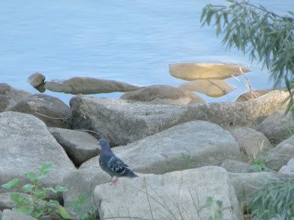
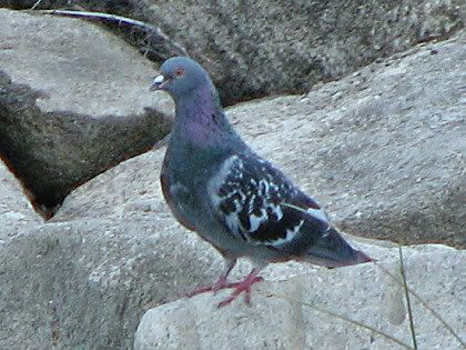
Rock Pigeon Columba livia
Family: Columbidae, Pigeons and Doves

enature
cornell

Cool Facts about Pigeons

There may be as many as 28 pigeon color types, called "morphs," but Project PigeonWatch groups them into just seven morphs.

Checker: If a pigeon has a checker pattern on its wings it is called a checker. Checkers can range from very light gray with only a few black checks, to very dark with only a little light-gray still showing. Some checkers have wing-bars; some do not.

Friday, August 08, 2008

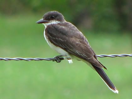
Eastern Kingbird

Eastern Kingbird:


enature
cornell

Pics provided at sites above don't really look like my pic, but my ND bird book pic does look like what I have.

google images

Also a WESTERN kingbird.
See
Kingbird photo shoot
Return

UPDATE:
Here

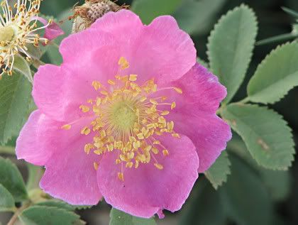
North Dakota State Flower - Prairie Wild Rose


The prairie wild rose is a very common sight along the rural roadside, and that is where I found this one, which happened to be in very good shape.

Prairie Wild Rose info from Northern Prairie Wildlife Research Center.

Also the state flower of Iowa, evidently.

UPDATE:
See another pic here.

Friday, August 01, 2008

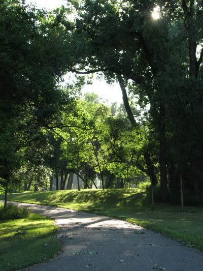
Morning Photo Walk

Where I went for a morning photo walk today.


It was a fabulous summer morning out there. Cool 50's and not muggy. Yay.

Yeah, I know those early morning shots of trees and sky are too high contrast to expose adequately, but I just love them anyways. The lighting is so dramatic and capture a mood.

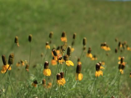
Yellow Cone Flowers


I have wonderful yellow cone flowers in my back yard, so we can't mow the lawn now. HA

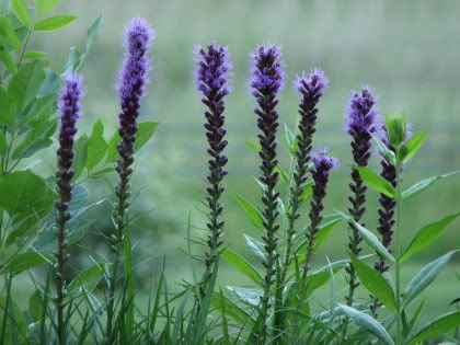
Purple Flowers


I sure like these purple flowers, but don't know what they are. In a burst of inspiration I tried a new angle and I liked the composition. It's difficult to take because of the direction of the sun. But one day I happened to catch the scene right before the sun came up over the hill behind them.

Purple flowers, like rocks, look best with a cool tone (white balance) instead of warm. Also I think purple flowers, like white flowers, might be best shot on a cloudy day. Better color rendering. Purple can be a difficult color to get correct in-camera. I often get blue instead of purple in-camera. The color fuchsia or hot deep pink is difficult too (just pink is ok). So is a wine color. A hot deep pink and a maroon wine are often rendered red in-camera,no matter what white balance I use.

UPDATE 25 Oct 08:
The flowers are purple liatris.

More Cloud Shapes

Clouds are fun. We get the most interesting clouds in the late afternoon or early evening.


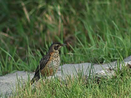
Can't ID This bird

Here's a bird I caught with my XSi and tele, different area, but same day as the hawk and eagles. I'm sure getting lots of bird photos this year. It's what shows up for the photo shoots.

Can't ID for sure, but I think it's some kind of thrush maybe?


20 Jul 09:
Could be a juvenile robin.
Google Images
And:
"The Juvenile American Robin’s underparts are tinged with cinnamon and heavily spotted with brown."

Kingbird Returns

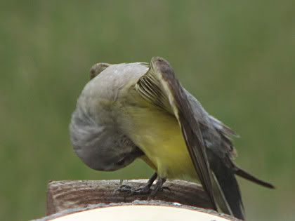
That kingbird returned for an evening visit once again. I had the bracket removed from the outdoor temperature gauge, so I got better pictures of him now. Ones without that ugly bracket behind his head.

Here's a funny pose.


Looks like he's checking things out down below, hey hey. He had an itch that needed scratching or something.

NOTE: Another Kingbird pic here.

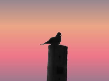
Mourning Dove at Sunrise


A mourning dove has gotten in the habit of sitting on our power line pole and singing every morning at sunrise. Terrible backlit and low light situation but I try anyway. Him and I played this little get closer game for a few mornings. I was trying to see if he'd acclimate to my presence, so I can get closer. Not. He had a clear boundary and stuck to it every time.

It is interesting to watch him when he coos. His chest puffs out and his tails bobs up and down when he's perched on the wire instead of the pole. It looks like he wags his tail. It made me laugh.

So anyway, crappy pictures, really. But I thought maybe I could turn it into a silhouette and add a different background. Something minimalistic with a sunrise tone to it to capture the same mood. I found a gradient that seemed to do it.

The nest? Abandoned. No sign of eggs or babies. Don't know what happened. Maybe the morning cooing is a mourning song.

More mourning dove pics here.

Sunday, July 20, 2008

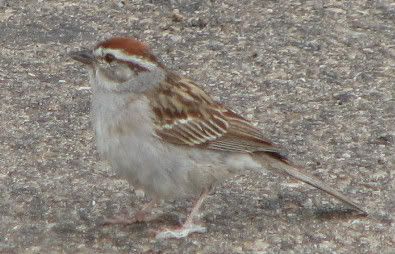
Chipping Sparrow


LINKS:
at enature
at cornell

Songbirds of North Dakota
Sparrows
Chipping Sparrow

UPDATE:
Here

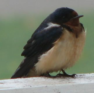
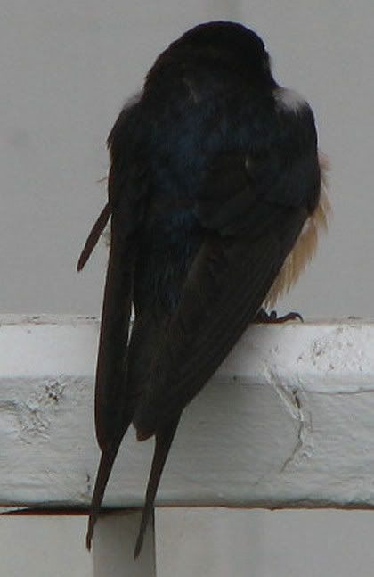
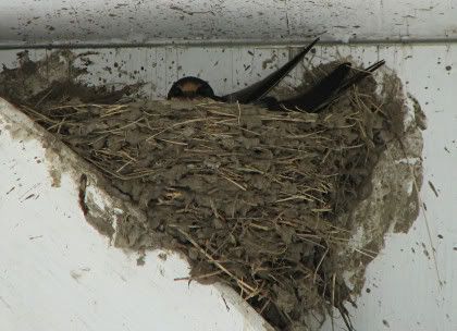
Barn Swallow


Juvenile?
Cornell says:
"Juvenile looks similar to adult, but tail shorter and less forked. Underparts paler."

It sure doesn't look like the pic at Cornell. This little fellow looked pretty rough. Maybe it was the damp weather (See note below).

See also enature.

He was standing guard by the nest up above him.


Barn Swallows
Northern Prairie Wildlife Research Center

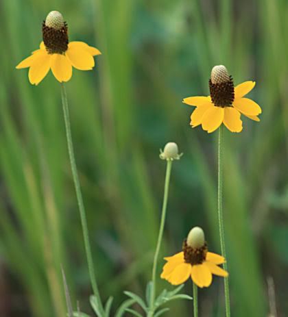
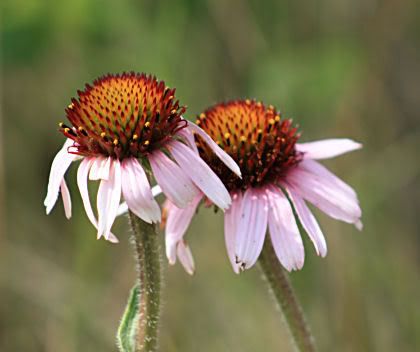
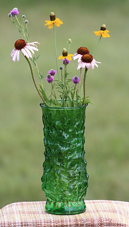
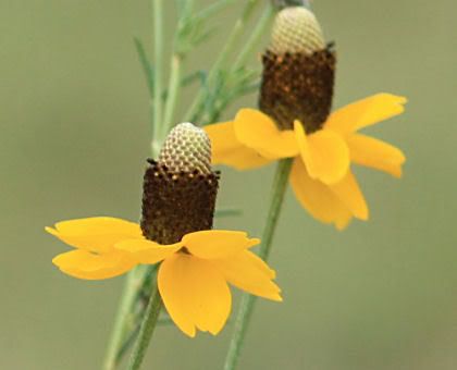
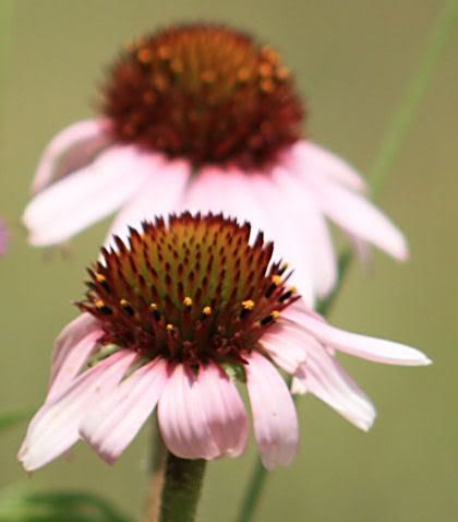
Coneflowers on the Prairie

From the field:


LINKS:

Native Wildflowers of the North Dakota Grasslands

Prairie Coneflower (Ratibida columnifera)

Purple Coneflower (Echinacea angustifolia)

Purple Prairie Clover (Dalea purpureum)
(This was that little purple flower in the vase photo.)

Thursday, July 17, 2008

Flew In For A Photo Shoot

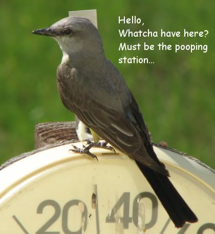
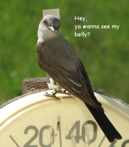
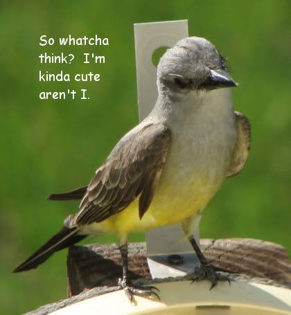
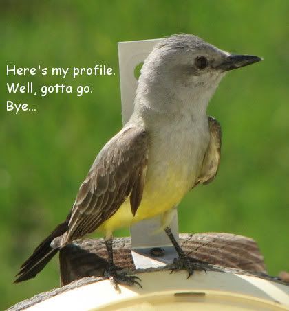
Look who flew in for a photo shoot. I mentioned before that birds like to perch and poop on our outdoor temperature gauge. Usually they fly off before I have time to grab my camera. Tonight, this one just stayed and stayed. I got 24 good shots of him. Very unusual.


What kind of bird is he? Some kind of Warbler? or Flycatcher? Kingbird? I'm not sure, but I think maybe it's a Western Kingbird.
I've definitely heard that sound around here.

On the Net - Western Kingbird:
at enature
at cornell

NOTE:
See also Kingbird Returns
and
Picturesque

21 Jul 09:
Junior flew in a year later - here.

Sunday, July 06, 2008

Mourning Dove Close Up


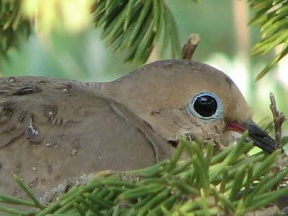
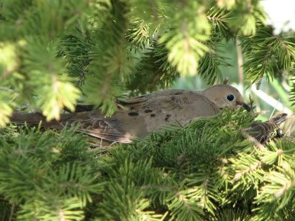
This is as close up to a mourning dove I'll ever get. (Original size, crop, no sharpen.) Incubating those eggs in one of our evergreen trees. I didn't realize it at the time, but it looks like there were two on the nest instead of just one? There's a tail on the right side.


I did use the zoom, so I wouldn't have to stand too close, and cause them even more stress by my presence.

At Cornell it says:
"A Mourning Dove pair rarely leaves its eggs unattended. The male usually incubates from midmorning until late afternoon, and the female sits the rest of the day and night."

The pic was taken early morning with my S3 IS 12x zoom Canon.

More mourning dove pics
here
and
here

Friday, July 04, 2008

Coleslaw Recipe


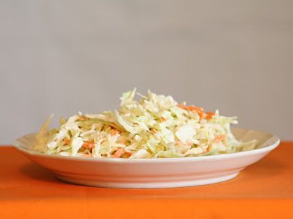
And here we have a crappy tripod picture of coleslaw.

Actually, I'm posting this because I always use the coleslaw recipe on the package of shredded cabbage I buy at the store and today no recipe on the package!

So now the recipe will be on my blog where I can always find it.

Coleslaw recipe
1/2 cup mayonnaise (I use light)
2 T milk
1 T white vinegar
1/2 tsp sugar
1 package (16 oz.) shredded cabbage

NOTE: I put extra sugar in it because I like it sweeter. I also don't mix the dressing in with the cabbage. I use it as a salad dressing on the side. Why? Because if we have leftovers, after a day, it gets watery and soggy.

Wednesday, June 25, 2008

Halftones and Textures


Idea from: graphicdesignforum

After reading that tutorial/article, I got the idea of just creating a fuzzy soft drop shadow on a separate layer, selecting it, then applying the halftone effect to the background gradient layer. It worked and I like the look (image above). It's just a fast easy way to create an imperfect feathered selection around the text and then adding something to it.

Why not apply something else, like a texture? I like that too.

Monday, June 16, 2008

Balls and Bubbles

When I was trying to create bokeh in Paint Shop Pro 9, I was playing around with the Balls and Bubbles effect and created some images I liked.

The backgrounds were radial style gradients gaussian blurred like the bokeh images were. See previous post.

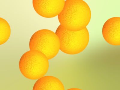
I discovered there is a newer preset (version X of PSP) for making oranges in Balls and Bubbles that is WAY better than the old preset, which I blogged about a while back. Link to previous Orange.

Image Creations:

Here's that Orange preset, tweaked to create multiple oranges instead of just one.


Water Drops Preset, tweaked and warped with that Warp Brush mentioned in my bokeh post, so they didn't look so perfect.


This one was a Green Bubbles Preset. I changed the color to white.


NOTE:
Paint Shop Pro stuff is getting harder and harder to find online. It is not very popular anymore since Corel bought it from Jasc. Version 9 is the best version and it is old. I often get my own blog links when I google the topic! So I know that can't be very popular when my own blog shows up as a top result in a google search! LOL

Bokeh With Paint Shop Pro

I've been trying different methods for making bokeh in Paint Shop Pro 9 (PSP9).
Bokeh generally refers to blurred backgrounds in photography.

But what I was trying to create were those soft light circles that I see are so popular on Flickr tagged bokeh.

I wanted something fairly easy and fast.

Examples of some of my attempts:


HowTo:

1. For a nice background, I used a radial style gradient and change the angle, repeat, center points.
Then gaussian blur at 30-50.

2. For the soft light circles layer I use a round brush preset called "confetti" and tweaked the settings and variance (F11). Step and Position Jitter settings gives random placement of the circles. Oscillating Fade Opacity and Color Blend Jitter randomly varies the color/transparency.

Layer Blend Mode was set to Overlay. The brush colors were then White FG, and a dark gray BG.

This gave me some nice circles but they looked too perfectly round.
So I did two layers of circles.

Layer One I lowered the hardness of the brush setting above and/or I used Blur Average Filter set to Aperture 3. That blur seemed to looked better than gaussian blur or the other blurs offered in PSP9. Motion blur could maybe useful too.

Layer Two, now this one was just a pure fluke surprise I discovered by trying different things. I used the Warp Brush, Cloud preset and lowered the Strength and Noise, lightly touched over the circles and that gave those imperfect circles I was looking for.

3. Try a different brush stamp like a heart and use the same brush settings and variance.

Image Notes:

Bokeh1
Background was a rainbow gradient (pj-5-crayonbow) radial style Angel 73, Repeat 2, Center Point Horizontal 77, Vertical 17. You don't have to manually set all those, though. Just drag around that circle/stick doohicky in the preview window. I don't know what it's called. Then Gaussian blur 50.

Bokeh2
Another radial style gradient add gaussian blur.
I created the gradient based on colors from a colourlovers article on
wine.
(I love that place!)

Bokeh3
Passionata radial gradient add gaussian blur.

LINKS:
Create bokeh with camera
Gradient Link (Set 4)
Warp Brush Cloud Preset

Monday, May 26, 2008

Movies Memorial Day

My fav was P.S. I Love You (2007).
What's not to love about this movie?
Great cast, great music, hunky guys.
I love romantic comedies.
Hilary Swank was good in this movie.
Gerard Butler is so good lookin'.

Based on the book by Celia Ahern who is from Dublin, Ireland, so it had to have some good old Irish in it, right. She is a producer for the ABC comedy Samantha Who?. Yes, I had already read the book. I can't remember much about it.

Some of the movie cast:
Lisa Kudrow as Denise Hennessey (30 Jul 63, Encino, CA)
Hilary Swank as Holly Kennedy (30 Jul 74, Bellingham, WA)
Gerard Butler as Gerry Kennedy (b. 13 Nov 69, Glasgow, Scotland, UK)
Kathy Bates as Patricia Rawley (b. 28 Jun 48, Memphis, TN)
Jeffrey Dean Morgan as William 'Billy' Gallagher (b. 22 Apr 66, Seattle, WA)
Harry Connick Jr. as Daniel Connelly, (b. 11 Sep 67, New Orleans, LA)

Lots of videos at YouTube on this movie. Here's a search link for the soundtrack.
P.S. I Love You Soundtrack

My Favs:
If I Ever Leave This World Alive, Flogging Molly
Galway Girl (Gerard Butler sings it in the movie. There's also a version by Steve Earle.)
Get Off, Prince (look for the karaoke scene)
Last Train Home, Ryan Star
Love You Till The End, The Pogues
More Time, By Need To Breathe
Same Mistake, James Blunt

A lot of the good songs aren't on the soundtrack CD.

Saturday, May 24, 2008

Bullet Buttons

In Paint Shop Pro9 make buttons instantly with Balls and Bubbles Artistic Effect.

Tube them.

Here are some buttons I made, if anybody wants them.


Transparent so you can cut out the ones you want.
Use as is, or tube them.
Add drop shadow if desired.

Wednesday, May 07, 2008

Inkscape 0.46 Gradients

I was recreating some Paint Shop Pro gradients in Inkscape by tediously entering the color code and stop in the gradient editor.
But wait, look at that Gradient Tool over there in the left side bottom of the screen. Wow. You can do all kinds of stuff with it if you know about it. I need to type up some notes on that.

Okay, so say you have an image and you want to make a gradient using the colors in that image. How do you do that in Inkscape?
Import image.
Create an Object. ( I clicked on the rectangle tool and mouse dragged to make a box.)
Click on Gradient Tool and drag it over the Object you just made to create an initial gradient.
Double Click anywhere on that gradient line and it creates a new gradient point or Stop. Click on that Stop to select it, click on the Dropper Tool, click on the color you want from the image, and viola, that color is now the selected Stop color.

See gradient features New for version 0.46.

The following is not new to this version of Inkscape, but I thought it was a handy tip.

Create an object, duplicate it several times, select all, evenly distribute (Object, Align and Distribute), click gradient tool and drag over all the objects, select a gradient. Instead of individually filling each object, the gradient is spread out over them all. This looks really nice when used with a monochromatic (?) color scheme or same color, different shades.


From:
Gradients over multiple objects
Also an example of this in the online manual here. (Look for "The eight objects share a common Gradient" section.)

Inkscape 0.46 Copy/Paste

Still diligently working in the new Inkscape and learning new features.

When did copy/paste screenshots and copy/past images from outside applications start working in Inkscape? I distinctly remember that NOT working when I was using Inkscape 0.45. This is extremely handy for learning. When I have a popup window within Inkscape that I want to capture for the settings, Alt/Print Screen to capture just the popup window and then Ctrl/V to paste it in Inkscape. I'm so relieved that works now!

HOWEVER, I discovered Inkscape is dumping junk files in at least a couple of places on my hard drive. I think these may be the screenshot images. What does that mean if I delete them? Will the image NO longer be in the svg file I pasted it into and saved? Yup. Now how would I know that? That's abnormal behavior for a graphics program. Inkscape is LINKING to an image file it creates and dumps in my svg folder. The svg folder ends up getting lots of junk files dumped in it. I also found junk files in my C:\Documents and Settings/User folder. Some of these predated Inkscape 0.46, so this was happening with the older version Inkscape also. I don't really mind that it does that; I would like to know about it, though, so I can delete what I don't want.

Friday, May 02, 2008

Inkscape 0.46 Turbulence

Probably the most interesting new effect in Inkscape version 0.46 is Turbulence.

I've been playing around with just two effects together to learn what it can do.
1. Turbulence
2. Color Matrix

You can come up with a LOT of different textures with just those two. I made clouds (like Photoshop), grungy metal, silky cloth, water, fibers (like Photoshop), stripes, etc. It's endless. Just with those two effects together.

Objects, Filter Effects,
New
Add Effects: Turbulence & Color Matrix
I didn't change connectors area.

Start Here:
Turbulence
Type Turbulence (Fractal Noise seems to give a smoother look.)
Base Frequency .001 and .002
Octaves 7
Seed 0 or slide to vary pattern.

Color Matrix
A little difficult to figure out.
This seemed to work:
Row 1 is Red
Row 2 is Green
Row 3 is Blue
Row 4 is darkness/lightness

I set everything to zero.
The I entered a 1.00 in row 4, column 3 and got gray.

Saturate or Luminance to Alpha from the Type drop down seemed to give you various grays too.
Different look, though, and I was trying to figure out the coloring.

THEN if you want a soft blue, for example, enter a 2.00 in row 3 column 4


Observations

1. Turbulence results have transparent areas, which you don't notice because in Inkscape the background is white.
So put it on a layer by itself and add different colored objects layered underneath it, so you can see what it really looks like.

2. Export as *.png to preserve transparency. However, you need to drag the layer off other layers below it before you export, otherwise the lower layers seem to get exported along with it.

3. When you move the object the effect changes. So dynamic, not fixed.

4. I always forget to check mark the filter so it's applied to the selected object.
5. Artifacts. Zoom in/out to get rid of them.
6. Pattern is bigger than object size.

7. Base Frequency:
1st parameter max and 2nd parameter min = vertical stripes
1st paramater min and 2nd parameter max = horizontal stripes

Blue Stripes
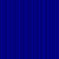
Turbulence
Type Fractal Noise
Base Frequency .400, 0.00
Octaves 5
Seed 0

Color Matrix
Everything to zero THEN
row 3 col 1 = 1.00 (blue)
row 4 col 5 = 1.00 (dark/light)

red = a 1.00 in row 1 col 1
green = a 1.00 in row 2 col 1
etc.

Fibers
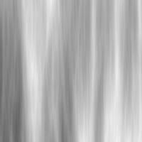
Turbulence
Type Turbulence
Base Frequency .015, .001
Octaves 7
Seed 0

Color Matrix
Everything zero, then row 4 col 3 = 1.00


Water
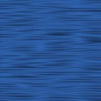
Turbulence
Type Turbulence
Base Frequency .022, .271
Octaves 1
Seed 143

Color Matrix
Type is Luminance to Alpha


Grungy Metal

Turbulence
Type Turbulence
Base Frequency.001, .001
Octaves 5
Seed 41 or slide it around til you get what you want.

Color Matrix
default THEN
row 4 col 1 = 1.00 (col 4 = 0)


Silk Cloth
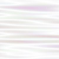
Turbulence
Type Turbulence
Base Frequency .004, .056
Octaves 1
Color Matrix is default, THEN row 4 col 1 = .40 and col 4 = 0


Wispy Sunrise Clouds
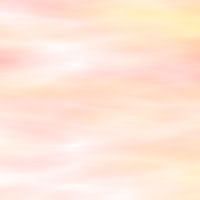
Turbulence
Type Turbulence
Base Frequency .004, .017
Octaves 5
Seed 150 or whatever you want.

Color Matrix
everything to zero, then
row 1, col 5 = 1.00
row 2 col 1 = 1.00
row 3 zero
row 4 col 4 = .50

Reference Video Link:
Episode 058 - Filter Effects
(See UPDATE2 note below.)
There is a clouds effect in the sample .svg (read comments), but it is quite different than what I'm doing here. The effect I was going for is more like the render clouds effect in Photoshop that you come across often in tutorials.
The sample svg cloud effect adds Flood and Composite layers. I think this might change transparency, dynamic, pattern size observations I listed above. I tweaked this filter and made a nice old paper texture and also some soft puffy clouds that looked different than what I made before.

Soft Puffy Clouds


Turbulence Type is Fractal Noise (but try Turbulence for a different look)
Base Frequency 0.011, 0.014
Octaves 7
Seed 336

Color Matrix
Changed it to default.
In the sample svg file you change Row 4 all zeros except Col 4 = 1.00

The rest of the settings are the same as the sample svg file.
I used a blue gradient that fades to white, so the clouds disappear on the bottom.

Old Paper
Same settings as the soft puffy clouds, only change the colors to various shades of light beige.

Flood color is #F9F5E1
Linear Gradient Colors are f5edc3ff, faeda6ff
Don't forget to try Type Turbulence instead of Type Fractal Noise, might like it better. Turbulence is a bit rougher.
Can you add Displacement Maps to that for a torn paper look? I tried it, but couldn't get it to work. I might not have the connectors right. I don't know if you can add it into the same effects stack or if you have to add it on a separate layer or what. I copied the object and moved it to a layer beneath, then added Turbulence & Displacement Maps to get torn paper edges. It doesn't look very good. Can see the edges of the textured paper layer on top.

On the old paper layer I tried the old way to make a rough edge: object to path, add nodes, add jitter. That's too fine, though, but it did fade the edges into the torn edges layer below it. Inkscape became extremely sluggish at this point.

The *.png export did not transfer the rough edges very well either. Here's the screenshot.



Anybody have better ideas on old torn paper look? Please leave comment.

LINKS:
Manual Section on Filters
Color Matrix Section

NOTE:
Gotta watch the memory in Inkscape.
I have to exit and reload when I hear my puter start to grind. Task manager tells me it becomes a major resource hog the longer I work in it. I wonder if it's the History? Can't clear it.

UPDATE:
Sample file included with Inkscape 0.46 software:
Inkscape\share\examples\turbulence_effects.svg
Shows how to add noise to an object - layer turbulence (source alpha) with composite (source graphic)
Type: Fractal Noise makes it noisy as opposed to Turbulence which gives it a completely different look.
Base Frequency is "locked together" or NOT linked so it only has one parameter instead of two.
Clearly demonstrates how Composite confines the effect to the borders of the object. It is set to Atop, try different Operator.

UPDATE2:
This is in reference to the Episode 058 - Filter Effects
video mentioned above.
There are TWO sample *.svg files with same name, newer version (dated 27 Apr 08) adds several more effects like sharpen and emboss. Click on the original flower picture, go into Effects, Raster, Add Noise. ALL the flower pictures get noise? Not sure why? Get some interesting textures that way, though.
Direct Link to both of these sample *.svg files.

UPDATE 11 Feb 11
Comments about Filters in Inkscape v0.48
here (Grouping object to filter.)

and
here (Change color with Flood.)