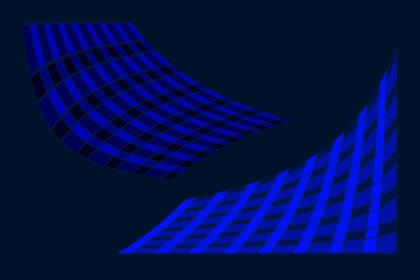
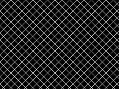
Wednesday, October 29, 2008

Textures - Mehdi Filters

I love this texture.


How To:
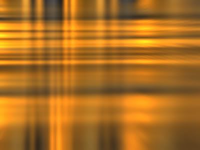
Start with something that looks like this:
PSP Liquid Gold pattern fill Scale 150


Then add:
Mehdi Weaver
PSP Radial Blur Zoom
Duplicate Layer, Dodge Layer Blend, Layer Opacity 48

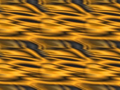
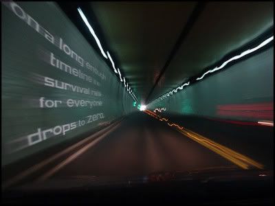
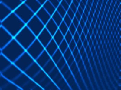
Here's another one I really like.


How To:
Start with something like this.
MuRa Clouds


Then add:
PSP Median 11 (blur)
Mehdi Flat Median (more blur)
Mehdi Fur 2 (circles)
Medhi Fur 2 again (O's)

(PSP = Paint Shop Pro 9)

I have usually used Gaussian blurs, but Median blurs are really interesting and I'm liking them better lately. The Radial Blur in Paint Shop Pro surprises me at how many different effects I can get from it. It has a bunch of adjustment controls.

LINKS:
Mehdi Plugins
MuRa Clouds

Mehdi has some really nice free plugin filters.
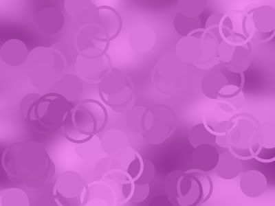
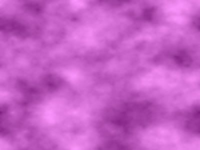
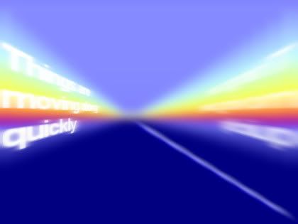
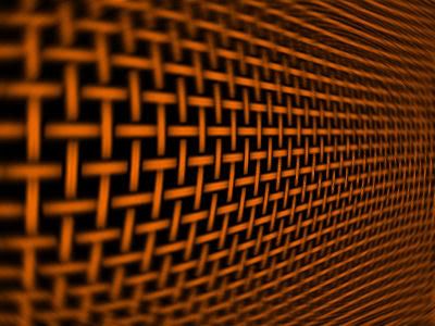
Here's a couple of textures I made with Projection and layered them together into one image.
I'm thinking it might be a good start on an abstract wallpaper.


Mehdi Gradient Smithy is fun to play with also.

Yeah, I've been into plugins lately, just cuz it's something different and it stimulates my creativity.

Saturday, October 25, 2008

Waxed Poetic


"Waxed Poetic"

I was thinking how odd that phrase seems to me. Not something I'd ever use.

(I was playing around with Sculpture in Paint Shop Pro 9 and made the image above. I like it.)

Here's the dictionary meaning of "waxed."


Now Google it for word origin.

From alphadictionary:

Start with Proto-Indo-European "wegs" meaning "grow, increase"
[g] became [k]
[ks] is spelled X
wegs --> weaxan --> wax

And there you have it. Makes perfect sense now. NOT. Read the much more complicated explanation at the link above.

How about some tunes to go with that?

Wax Poetic is a band. And Norah Jones was a member.
Didn't know that.

Google search for Wax Poetic music videos at YouTube.

The song, Angels, is pretty good.
Different music.
I have Norah's "Come Away With Me" CD.

Tuesday, October 21, 2008

Typography Art


Started with a linear gradient that looks like this.


Layer Palette, which tells the story of how I did the rest.


Feedback effect pulls the gradient lines into tunnel shape.
Deformed text to fit the tunnel shape.
Road line was a Custom Dashed Line Style.
The rest is using different blurs: Gaussian, Radial Blur Zoom, Motion Blur.
And different Layer Opacities and Layer Blends.

Inspiration:


Typography Art

I just wanted to see if I could do something like that tunnel in Paint Shop Pro 9 and I thought it turned out well enough to post to my blog.

There are more examples that I like at the link. Many of them are filling an image or text with text. I don't know how to do that.
I know how to fill text with an image or pattern fill. There are some filters that will fill an image with a letter or random letters, but that's not the same thing. (I was thinking of VM Natural Experimental filters.) I could create a seamless pattern with text on it and use it as a fill for the image/text. But that's not the same thing either. Hmmmm.

This one makes me laugh.


Could do that with Wordle.

How about this one?


I tried MuRa's Meister Copies filter and came up with this.


I just tried it with Arial font first to see how it would work. It needs a nicer font.

Sunday, October 19, 2008

Pottery Barn


Every once in a while I make an online trip to Pottery Barn just because I love the big beautiful pictures. I never realized how much work that must be to set up everything so nice and take pictures of it. But now that I'm dabbling in photography I know this can be very time consuming and is more difficult than it looks. Whoever does this for Pottery Barn sure does a good job. I'm glad they go thru that extra work so I can enjoy browsing the place online.

Thursday, October 16, 2008

Zen Art


Going thru my fonts, I found this zen-like one called Far East Font, and happened to actually read the text file that comes with it, which explains how to use it. I thought it was pretty clever, and no, I did not know that's how you use this font.

Soooo...Remember that smart blur, unsharp mask art idea I've been blogging about? Well the art posted above is that same technique.

This is the original photo (crappy, did not like it):


I ran smart blur, unsharp mask on it, lightened it a bit, then cropped parts I thought were interesting textures.
Then I fiddled some, maybe did some minor cloning, maybe flipped, mirrored, or rotated the image so the finished image would look good with the text on the side.
Add the Far East Font (read sideways), white and black borders.
And viola, my zen art.

I like it.
I did a bunch more, but these are my favs.

NOTE: I could have added some drop shadows to the borders to give it a little depth, but I was too lazy to go back a redo it.

Music Art


Fonts:
City Lights - Little City 2000 font
Music Text - Parisian BT font (or Paris Normal)
Piano Keyboard - Music Fun font

The curves were made easily using Mesh Warp.
I created a black white red hard line gradient for background.

Inspiration: A rug

Monday, October 13, 2008

Magpie

Not very good, but best I have so far of the magpie.


enature
cornell

Saturday, October 11, 2008

Warp and Blur

The below images were created from scratch using Paint Shop Pro 9.
Reminds me of photography I've seen where someone will take a picture of some pattern or texture using shallow depth of field.

I started with a pattern fill that looked like this.


And ended up with this.


Combination of Warp and Radial Blur effects.

I got the coloring and highlights by adding a bottom blue fill layer and changing the pattern layer to dodge blend mode.

In Paint Shop Pro 9 I think there are more adjustment controls with the Radial Blur than in Photoshop? In PSP9, you can adjust just about everything from type of blur, to where, to how much, etc. And you can preview it and watch your image change as you tweak the controls so it is very easy to just play with the adjustments until you get something you like. Warp works the same way.

Here's another one.
The pattern was made with the Weave Effect.
No layering with this one.
Similar warp settings.

Wednesday, October 08, 2008

Bleeding Love

Another music video I dug out of YouTube...


So HOT.
So much angst!
An all time top video at YouTube.

Bleeding Love, by Leona Lewis (b. 3 Apr 85) so 23 years old.

Another Whitney?

More Lewis videos at youtube.

Image:
Fast and easy.
Red Vector heart with warp brush deformation map drips applied to it.
Font: Buffy.ttf (also called Buffied.ttf)

Human, The Killers - Denser or Dancer?


Top Track at elbo.
Human, by The Killers
Not a huge favorite, but deserves some time on my mp3 player, and it's growing on me.

From wiki, Is it Dancer or Denser?
There has been much confusion and debate over a lyric in the chorus of the song. This is regarding whether or not Brandon Flowers is saying "denser" or "dancer", when posing the question "Are we human or are we denser/dancer?"

Some have said that the lyrics do make sense because "dancer" might be appealing to the "marionette" sense of the word, in which case the song is asking whether we are human and make our own independent decisions or whether we just dance in a show made by, and perhaps even made for, someone else.

On Amazon, the editorial review for the album states the song says "Are we human, or are we dancer?" and also says that Flowers said the lyrics were inspired by a disparaging comment made by Hunter S. Thompson about how America was raising a generation of dancers.[4]

(NOTE: Now Wiki says nothing about marionette, and lists IslandRecords link for the Thompson reference.

Comments from popwatch:
" 'Dancer' is poetic and I believe it refers to a lack of truth, substance, emotional depth."

"dancer is singular because it's a play on words...the word dancer describes us much better as a species than the word human. "

I googled for idioms that might be similar in meaning.

Came up with:
"Dance to someone's tune" and "song and dance."
Also "pulling the strings."

LINKS:
To find the song at youtube, Google it.
songmeaning
songfacts

What else do I have of The Killers?
Mr. Brightside
Somebody Told Me

Monday, October 06, 2008

Those Audi Commercials

I happened upon this at MeFi.

And then somehow landed at the Audi site where you can watch and then download the movies and the music. (Also at truthinengineering.com.)

Nice!

If all commercials were made this good, I could actually enjoy them, instead of getting irritated and switching the channel.

More discussion at adtunes forum.

VLC media player will play the downloaded movies (filetype *.m4v).

The Audi commercials are at YouTube also, but why would you go there when you can view and download the full screen high quality real deal at the Audi website.

High Pass Sharpen In Paint Shop Pro 9

I use Paint Shop Pro version 9 and it does not have a high pass sharpen filter.
But it is possible to do it manually.
I dug this up from an old Corel newsgroup post.

High Pass Sharpen
1. Duplicate the image layer.
2. Duplicate the duplicate layer.
3. Set the opacity of the topmost layer to 50%.
4. Gaussian Blur the layer. Start with something like a Radius of 1.00. (This is where and how you define what "high" spatial frequencies you are going to "pass".)
5. Do Negative Image on the blurred layer. (Adjust, Color Balance, Negative Image)
6. Switch off the visibility of the original image layer.
7. Merge Visible the top two layers.
8. Run Histogram Stretch on the merged result layer to magnify the fine detail. (Adjust, Brightness and Contrast, Histogram Stretch)
9. Make your original layer visible again.
10. Set the blend mode of the topmost layer to Hard Light, Soft Light or Overlay depending on how aggressive you want the effect to be and adjust the layer opacity to control the sharpening effect.

To Script this (make these steps automatic with a click of a button):
Don't record step 10 in a script, just adjust it by hand. All the recorded steps 1 to 9 can be marked Silent in the script, but make step 4 interactive.

My Notes:
On the photo I tried it on, Effects, User Defined Filter, High pass Preset was similar to the above High Pass Sharpen when blend mode was set to Hard Light in step 10. Might not always be the case for all photos, but something to try.

High Pass Sharpen is used to get a certain photography effect, called the "Dave Hill Look" discussed at flickr strobist group. Instead of the Photoshop Vivid Light, I used Paint Shop Pro Soft Light layer blend mode.