I got the bug to install GIMP and see what it's like, even though I don't really need another graphics program. Paint Shop Pro is dying since Corel bought it from Jasc, so I'm unsure about it's future.
Is it gimp or GIMP?
GIMP, I think.
The first thing about GIMP I wanted to know was how well it supported the use of free Photoshop compatible (*.8bf) plugins/filters.
"Pspi is a GIMP plug-in that runs 3rd-party Photoshop plug-in filters."
For Windows, download
gimp-pspi-1.0.7.win32.zipand unzip. There is only one file in it, pspi.exe.
Copy and paste it in GIMP's plug-in directory here:
C:\Program Files\GIMP-2.0\lib\gimp\2.0\plug-ins
Load GIMP and under the Filters Menu there will be an added option called:
"Photoshop plugin settings"
Click on that and select a path for the plugin (s) you want to load.
I then had to exit GIMP and reload it before it would look for and load those plugins.
I got a popup error on Paint Engine plugin.
It would not work in GIMP. (Possibly because of that ini file?)
Look under the Filters Menu in GIMP again and the plugins should be listed there.
Most plugins I tried worked okay in GIMP.
IrfanView might have better support for 8bf plugins, so that's an option. Paint Engine works in IrfanView.
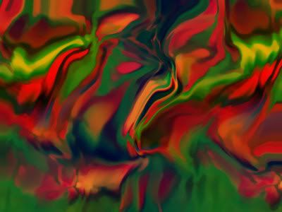
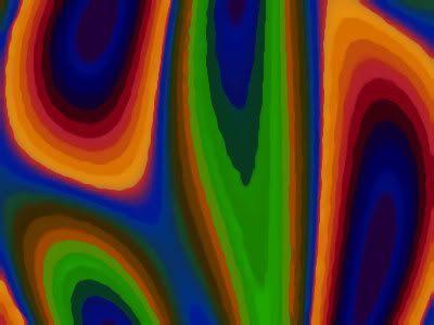
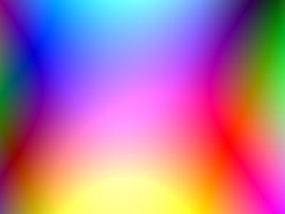
Since I had just recently been on a fractal kick, I noticed right away that GIMP offered some fractal effects. Fractal Explorer is listed under Filters, Render Menu. More Fractals under Filters, Render, Nature Menu. But those looked too rudimentary and not user friendly. Apophysis would definitely be better.
There's that initial struggle to get around a new interface, but GIMP is pretty easy to learn. Windows behavior support is poor--typical of Open Source software, though, so no surprise. What is up with that multiple popups thing when saving jpg files? Drove me crazy. I need to find out how to make that go away.
I looked in the Filters area first for things that might be in GIMP but not in PSP.
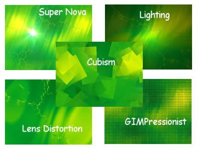
Some interesting effects I want to play with more are:
Filters, Artistic, Cubism
Filters, Artistic, GIMPressionist (Might be like PSP brushstrokes?)
Filters, Distort, Lens Distortion (has a zoom and different from PSP)
Filters, Light and Shadow, Supernova
Filters, Light and Shadow, Lighting Effects (different from PSP)
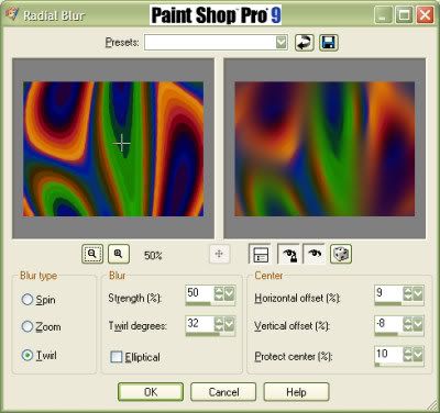
Paint Shop Pro 9 has a LOT more features than GIMP.
I would definitely miss it.
I've fiddled with Photoshop, but don't like it much.
Photoshop does have some nice filters/effects, though.

 Okay, let's not get too serious here.
 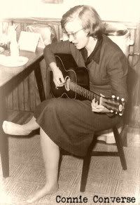 I found out about Connie Converse via the NPR Song of The Day,


 Here's a good weekend read.
 I read something different, a sci-fi book.