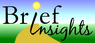
Well, so far, I like this one the best:

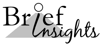
Here's a plain vanilla version:

I wasn't sure about how the "road" should intersect with the text?
I might recreate in Inkscape for a high quality vector, but for now, this was just created in Paint Shop Pro 9 on layers.
The fonts were: Garamond, BlackJack Regular, and Scriptina.
The Scriptina "I" was edited, of course.
The "road" is a box shape, deformed, colorized, waved.
The background is just a ready made gradient called "landscape morning."
I figure the plain vanilla version is easy enough to change into whatever theme I want if I get sick of the earthy look.

No comments:
Post a Comment